Assignment 9–Data Sculpting
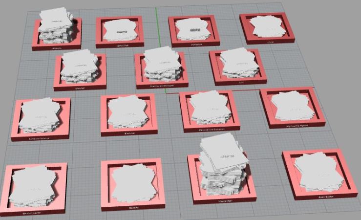
For this project I took statistics from the distribution of undergraduate students in the college of engineering across majors to create a visual representation. I decided to create stacks of acceptance letters to show the distribution of undergraduate engineering students across their majors. First I created equal sized stacks of papers and then shrunk them by the percentage of undergraduate engineering students in the major. This shrink made the stacks hard to differentiate, so I made each stack 5 times its size to make the differences more substantial.
Data:
Found at http://www.colorado.edu/engineering/about/facts
In progress photos:
Final Photos:
Assignment 8–Collection
Why:
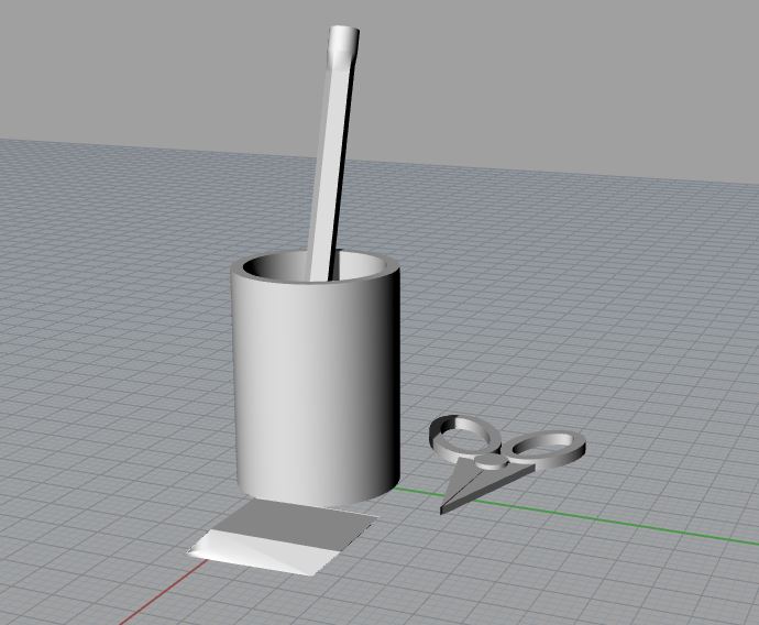
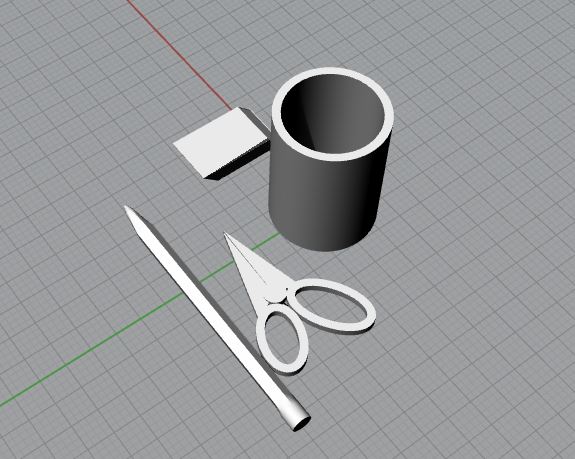
For this project I put together several forms of school supplies. The different pieces each had different shapes to play with from the pencil made of pentagons to the cup that was all concentric circles. I also feel with this being an academic program that the connection between the items was very familiar and clear.
Progress photos:
Final Images:
Assignment 7–Connector
For this assignment I made a slide and lock joint to experiment with modeling joints and to create something that is sturdy once it is locked in. We are still playing with joints for our next project, but this could be used. Yet to be determined.


Project 3 Inspiration
Goals:
- Combine functionality with aesthetic beauty
- Appeals/works for more than one person (versatility)
- Experiment with multiple materials and combining them
- Work with more than one joint type
- Intuitive form that relates to the function
Inspiration:
For this project, my partner and I wanted to create something that would serve a function and would also be beautiful. We decided on this because it is always fun after a project to have something that can serve a purpose, but in general you never want to create something unappealing. In addition we wanted to think about what would provide enough versatility to appeal to multiple users’ interests. Then to improve our ability to make we want to experiment with different materials to find the best fit for this project. We also decided to experiment with joint types to expand our knowledge in that realm. Lastly, we wanted to look at the user experience to provide an item that is intuitive to use. So if we made a coffee cup for example we would want the design to clearly state that it is supposed to be for drinking out of.
Project_2
Artist Statement:
Classically Tiered Sewing Stand
This sewing stand combines a classic aesthetic with functionality to create a source of inspiration for sewing projects.
For this project I wanted to create a functional object that would inspire me to start sewing more. I was inspired by antique tiered serving stations and ultimately decided to create a classic tiered style sewing stand. I chose to make my design out of wood to uphold this classic aesthetic. In addition, wood offered more friction so that the dowels would stay in place better than if I had used acrylic. I chose to leave the sides of the pieces burnt from the laser cutter because the wood I chose had internal layers that did not look classic. The darkened wood felt more natural and fit with the piece better. My original design had three tiers, but I felt like two tiers were more practical because it allowed for the user to reach more easily into the bottom tier while keeping the design small enough as to not take up a ton of room on a sewing table. To add to the practicality of the piece I placed small, removable, wooden pieces on the top tier that swing out. One of these extra pieces has a cut out slot for scissors. Ultimately the piece is a functional, classic sewing stand.
Technical Statement
After I established what I was going to do for this project I built out my file on Rhino. Then I was off to get the file laser cut which went fairly well except for a few pieces did not cut all the way through. I took a small knife and ran over the cut lines until each piece was free. On the circular pieces this was a little more difficult resulting in some small scratches on the under side of the shelves. Once everything was free it fit together fairly well. I did have an issue with the dowels fitting into the piece because I had cut the dowel holes to be the same diameter of the dowels which did not hold the pieces tight enough. I was able to solve this problem by placing rubber bands around the dowels.
Rhino Files


Work in Progress Images:
Final Product Images:


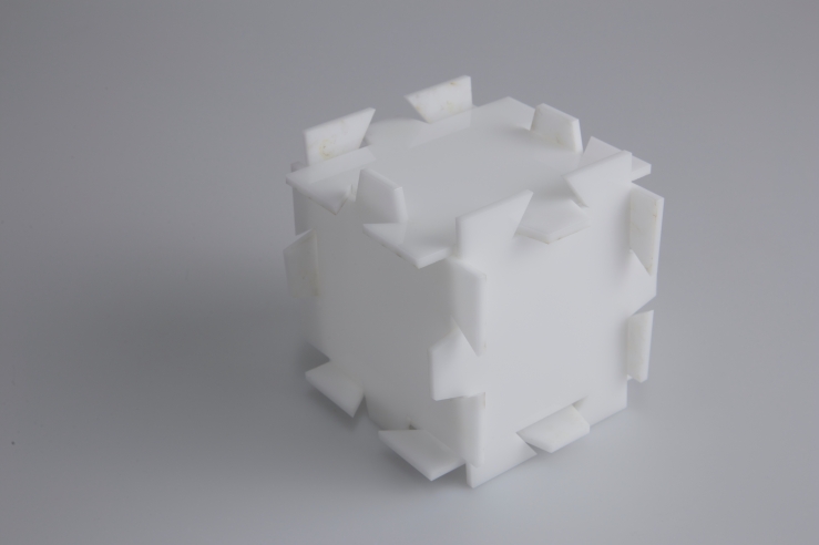
2D Joinery
My partner and I created our joinery in rhino. Each tab needed to be equal length and flat on the end so that the final box would sit evenly on a flat surface. At first there was a mistake made in the file where the middle sections of each side were uneven. After the error had been fixed we had a beautiful box. We chose to print in acrylic because it allowed for lights to be put in later which would give the box a nice aesthetic purpose. The white would help to obscure the wires in the box if a light was inserted.


Assignment 6
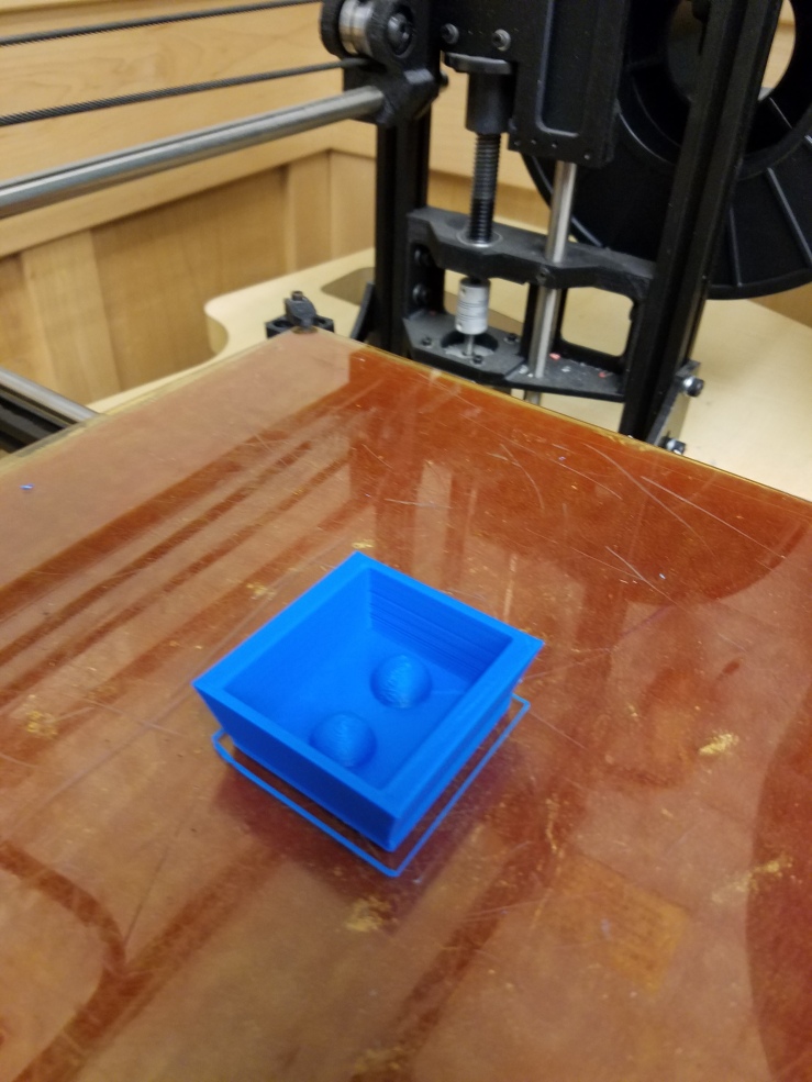
This process was a little frustrating because it was the first time I had worked with the machines and my files were not prepared correctly. The first time I tried to print my soap dish was turned into a solid block. I stopped printing part way through and signed up for a backup printing time.


Once I had gotten my file fixed, I came back to the lab and realized that my bottom was too thin and the 3D tool for fixing STL files had added an overhanging bit to make my project airtight. At least that is what I’m hoping happened and not that I just messed up. I made a thicker base and tried to get rid of the overhang, but ultimately left it so I could use the rest of my printing appointment. Since I had used some of my time to fix the file I needed to cut down my figure so it would print on time. Then my first 2 attempts started printing wonky immediately. On my first try the lines were not being formed straight, which I was able to fix by adjusting the glass top on the bed. On the second try part of the material got stuck on the nozzle which tangled up what had already been put down. Then on my third try I hadn’t noticed that the bed and nozzle had cooled down so no plastic was distributed onto the bed.
Video of one fail: https://vimeo.com/185649635
On the fourth try things started moving! I had wasted so much of my scheduled time by this point that my object turned out being nearly half the size it should have been. At least I have made all of these errors now and hopefully future prints will go smoother.
Project 2 Inspiration
For this project I want to make a tiered sewing storage display. I want to create something that feels classic and retro while also making it fit into a modern sewing table. To create a solid structure the body of the stand will be thicker and will form a conifer like shape. The design will include 3 rounded shelves with varying sizes. I am hoping to insert some sort of peg or hook to add extra storage. The final product will most likely be in wood to add to the timeless feel of the piece. I am debating whether to paint the final product or to perhaps just add a stain to finish the work. I foresee the most difficult part of this project to be the small joinery mechanisms.
Assignment 3-Typography
The Aesthetic:
My font will be rustic yet youthful. My inspiration for this project is the modern craze for furniture and room decorations that seem rustic with patina. I wanted to create something that both fits with that trend while also being able to fit in a child’s room.
How I accomplished my aesthetic idea:
I started out with a dafont font called wood print from the Western section. Unlike some of the other Western typefaces this one was less adorned and therefore a perfect match to create a simplistic and youthful design. The piece retained its rustic feel through the heavily weighted serifs and the sharp contrast between the thick serif edges and the then corners. I did cut down the rustic feel a little in Rhino by reducing the weight of the bottom serifs, but the wooden material that this would be made out of should be enough to compensate for the rustic feel. In addition, the letters seem playfully squished together which also accomplishes the goal of making this a connected piece.
The Chaotic City
The Chaotic City
A visit to a large city for a small town local.
My inspiration for this project came from how I feel, and how other people from small towns might feel, in a large city. I showed some of the chaos by twisting, bending, tapering, etc. All of these deformations created a twisting model that does not make sense when it is viewed which leads to a small amount of discomfort. The buildings then arc over the path to create feelings of being small and overwhelmed. In addition, the street is made of gentle curves which was intentionally simple and expected to juxtapose the buildings above. While many of the design elements are meant to be uncomfortable, the deformations of the buildings also create something interesting to examine. This interest mimics the feeling of excitement when site seeing, which is overwhelming and new but also fun and interesting. Lastly, I tied the excitement and the feeling of discomfort together to create the color palette that includes colors both associated with aggression—red specifically—and colors that are associated with joy—yellow and orange. In addition, this color palette is associated with circuses which both have uncomfortable displays and displays that make us joyful. Overall my piece is meant to express the anxiety and excitement with exploring a larger city.
Flyer -> chaoticcity
Monday’s Response
I agree with the video’s assertions on how each object has its own personality and conveys a certain feeling to the user or viewer. I especially liked when he related animals and beings to the objects because it added a touch of humor while still supporting that each object has an individual personality. I also would agree that we will feel and interact differently with different designs. I am more productive in an environment with lots of storage so I am not surrounded by clutter for example. I also would feel more comfortable in a traditionally styled room versus the sterility I feel in modern designs.
In the video, I also found that the correlation between how good an object was and how high its price was, was interesting. An Ikea table still serves its function despite it being cheap yet Ikea’s furniture is not considered as “good” as a more expensive item despite the quality it does its job with. I can see the association of expense with quality in my perceptions of things because if offered two tables for free I would take the one that would sell for more. However I do not think that for all cases I will view the more expensive item as better. If I find a solid piece of furniture for cheap I am more thrilled than if I buy a similar product for more. Perhaps that is due to where I am in my life as a “broke college student” and my somewhat frugal nature.
Assignment 2-Game Piece
My game piece is designed to represent the Greek legend Atlas who holds up the world. I thought it was a fun tribute to the Atlas building, and that it would be a cool little challenge.
Assignment 1 First Model
I made a holster that holds both a flash drive and a wireless mouse USB plug-in. I was inspired to create this project because for many of my classes I need my flash drive and will usually go diving through my backpack for the tiny wireless mouse plug-in. By putting them together it would reduce my chances of losing the little thing. The design fits inside of a 3in by 3in box when the caps are on.
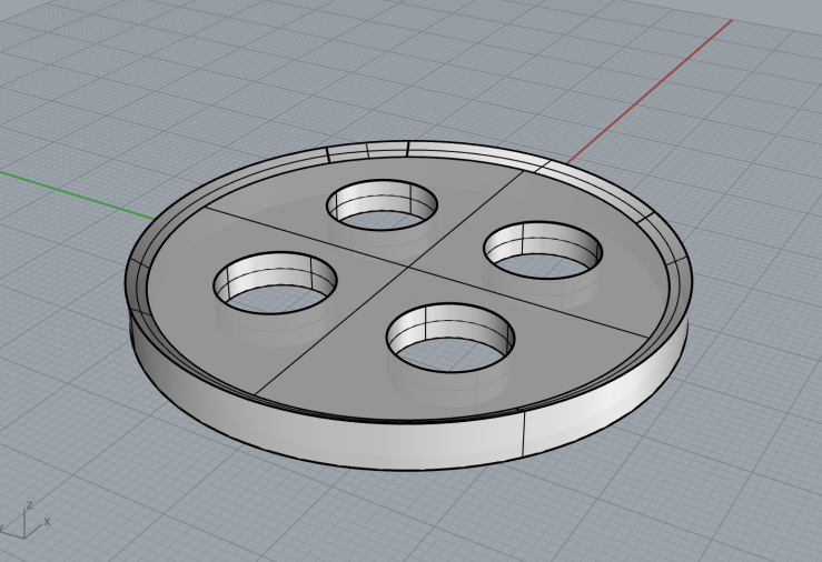
Form Button Lab
For this project, in Rhino, I created two concentric circles and extruded them to slightly different heights to create the button’s outer lip with the loft command. I added a surface on the top and bottom of the extruded inner circle to create the button’s main surfaces. 4 circles were placed on the bottom surface of the button and extruded to the top. Then the booleansplit command was used to remove the circles from the top and bottom surface.